Andy Micallef HND Graphic Design
Monday, January 27, 2014
Sunday, January 26, 2014
Dada
Dada was the result of a reaction to WW1, it was a art movement of the European avant garde in the the early 20th century. To quote Dona Budd’s The Language of Art Knowledge, ‘Dada was born out of negative reaction to the horrors of World War I. This international movement was begun by a group of artist and poets associated with the Cabaret Voltaire in Zurich. Dada rejected reason and logic, prizing nonsense, irrationality and intuition.’
The movement primarily involved visual arts, literature, poetry, art manifestos, art theory, theatre, and graphic design, and concentrated its anti-war politics through a rejection of the prevailing standards in art through anti-art cultural works. In addition to being anti-war, Dada was also anti-bourgeois and had political affinities with the radical left.
The movement primarily involved visual arts, literature, poetry, art manifestos, art theory, theatre, and graphic design, and concentrated its anti-war politics through a rejection of the prevailing standards in art through anti-art cultural works. In addition to being anti-war, Dada was also anti-bourgeois and had political affinities with the radical left.
Artists decided because life and the war made no sense why should their art
Dada’s use of typography and photomontage gave a dif- ferent standard and flexibility to Graphic Design
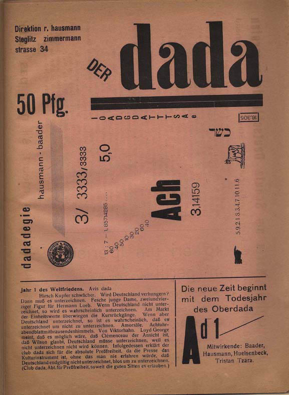


- Used bold, thick, san serif fonts
- Explored using more white space
- Set typefaces diagonally, horizontally, and vertically
- Experimented with line spacing, and letter spacing

- Cutting and pasting pictures and type together from other sources of media
- Able to give different meanings to their art by combining images
- Explored photo manipulation, which today we now use photoshop for
Emil Ruder

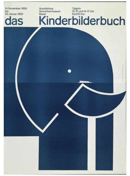
Emil Ruder was born in Switzerland in
1914 and he was a typographer and graphic designer, he also helped Armin
Hofmann form the Basel School of Design and establish the style of design known
as Swiss Design which later on wolfgang wiengart studied and thought there.
Emil taught that, above all, typography's purpose was to communicate ideas through
writing. He took the importance on sans-serif typefaces and placed them into his
work.

Hans Arp, Emil Ruder and Armin Hofmann at the Basel School
of Design in 1961
Like most designers he is associated as
part of the Swiss Design movement which he favored asymmetrical compositions, placing
a high importance on the counters of characters and the negative space of
compositions. A friend and associate of Hofmann, Frutiger and Müller Brockmann,
Ruder was the major key role in the development of graphic design in the 1940s
and 50s. His style has been adopted by many designers, and his use of grids in
design has influenced also the development of web design on different levels.
Hannah hoch

Hannah Hoch born in 1889 in Gotha, she was a dadaist artist. She started studying at the collage of art and craft in berlin, were she frequented the curriculum glass design and graphic arts. After she continued her studies studies on graphics sector at the National Institute of the Museum of Arts and Crafts. In 1915, Hoch worked with Raoul Hausmann who was a member of the Berlin Dadaist movement in 1919. When Hannah Hoch started working in the handicrafts department, the influence of her early work and training had reflected her later work (involving dress patterns and textiles).
Years later Hock had developed more friendship with other dadaists such as, Kurt Schwitters and Piet Mondrian many more. Also with Hausmann, they discovered the first art form technique that became known as photomontage. She is best know for her work of the Weimar period, when she was one of the contributor of the today's known photomontage. She died at the age of 88 in Berlin.
Noam Chomsky's bespectacled eyes and his arm and hands holding chalk along with actress Colleen Dewhurst's mouth and chin and a relic found in the Indus Valley pasted on a found sepia photograph - Homage to Hannah
Hoch.

Reference
Livingston, A. I., 2003. Graphic Design and Designers. London: The Thames & Hudson.
Saturday, January 25, 2014
Victor Moscoso
Mososo was a formally trained graphic designer who borrowed from comic books, Victorian images, Art Nouveau, and pop art. He used the techniques of vibrating colors to create the ‘psychedelic’ effect in many of his art work. The vibration is achieved by taking colors from the opposite end of the color wheel, each one having equal value (dark to light) and intensity (brightness).
He created evocative, vibrant, erotic, patterned posters designed for the newly emerged psychedelic culture of San Fransisco in the late 1960′s. He used hand made font, photo collage, and pop art to create a new aesthetic portraying psychedelic consciousness. He created “slow read” posters where the text was nearly unintelligible unless times was taken to stare into the image and sort out the dazzling effects of the contrasting colours and intense patterns.

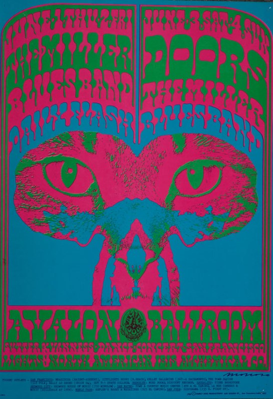
Victor Moscoso Avalon Ballroom 1967 The Doors, Steve Miller Blues Band

Victor Moscoso The Matrix 1967 Janis Joplin with Big Brother and the Holding Company
Art DECO(rative)
Art Deco was an art movement that
lived from the 1920s until around 1940. It stated in France with a group of
French decorators, designers, and artists at the Exposition Internationale
des Arts Décoratifs et Industriels Modernes, the name Art Deco was later
coined from that title which means decorative arts.
Art Deco was a very modern movement,
celebrating the beauty of technology in the early 1900’s. Art Deco contains
many references to trains, planes, cars, and skyscrapers, mixing art with
scientific improvement.
When human figures are seen in Art Deco, they’re often
very stylized, like in this painting by Tamara de Lempicka entitled Sleeping
Woman.
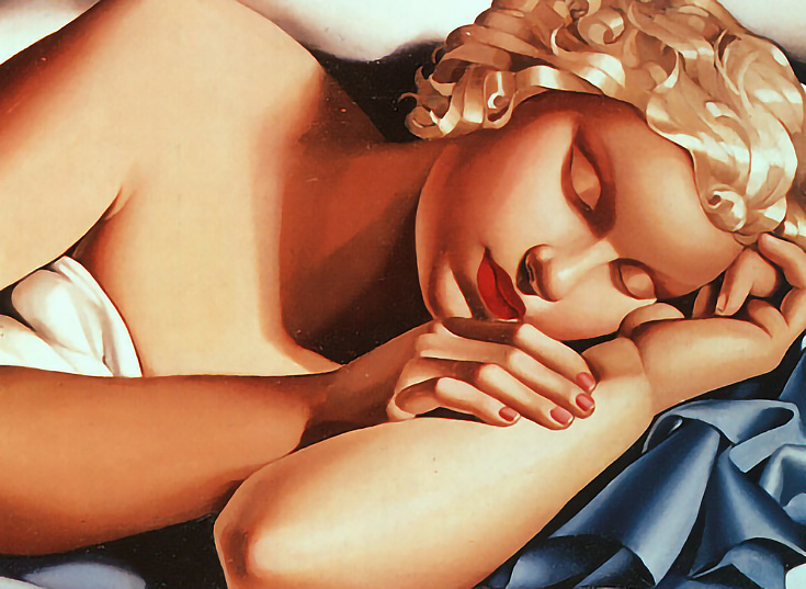
Every part of this painting is a
geometric solid—the figure’s head looks like it was carved out of a single
sphere, and her neck, arms, and fingers are all cylindrical.
Notice her metallic curls as well.
Metal looked figure prominently in Art Deco, and when actual metals couldn’t be
used (in paintings for instance) gradients were substituted to look like metal.
In that era where technology and
machines were being increasingly idolized, it was a revolutionary time where the artists began to perfected
humans, with matte skin and metal for hair.
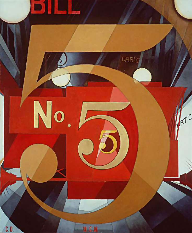
Bold colors, rays, and other strong geometric patterns
were a trademark of Art Deco too. Charles Delmuth’s I Saw the Figure Five in
Gold is a great example of Art Deco movement, geometry, and color.
Although the movement ended in the 40s, Art Deco is still
used today, often as a design element that references the optimism of the 1920s
and 30s when it seemed as though nothing could stand in the way of human
progress.
Reference
Elif Ayiter, N/A. The History of Visual Communication. [online] Available at: <http://www.citrinit as.com/history_of_viscom/index.html> [Accessed November 2013].
Livingston, A. I., 2003. Graphic Design and Designers. London: The Thames & Hudson.
Subscribe to:
Comments (Atom)


