Monday, January 27, 2014
Sunday, January 26, 2014
Dada
Dada was the result of a reaction to WW1, it was a art movement of the European avant garde in the the early 20th century. To quote Dona Budd’s The Language of Art Knowledge, ‘Dada was born out of negative reaction to the horrors of World War I. This international movement was begun by a group of artist and poets associated with the Cabaret Voltaire in Zurich. Dada rejected reason and logic, prizing nonsense, irrationality and intuition.’
The movement primarily involved visual arts, literature, poetry, art manifestos, art theory, theatre, and graphic design, and concentrated its anti-war politics through a rejection of the prevailing standards in art through anti-art cultural works. In addition to being anti-war, Dada was also anti-bourgeois and had political affinities with the radical left.
The movement primarily involved visual arts, literature, poetry, art manifestos, art theory, theatre, and graphic design, and concentrated its anti-war politics through a rejection of the prevailing standards in art through anti-art cultural works. In addition to being anti-war, Dada was also anti-bourgeois and had political affinities with the radical left.
Artists decided because life and the war made no sense why should their art
Dada’s use of typography and photomontage gave a dif- ferent standard and flexibility to Graphic Design
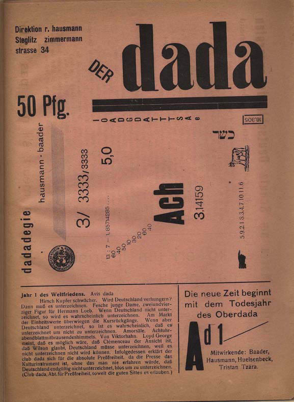


- Used bold, thick, san serif fonts
- Explored using more white space
- Set typefaces diagonally, horizontally, and vertically
- Experimented with line spacing, and letter spacing

- Cutting and pasting pictures and type together from other sources of media
- Able to give different meanings to their art by combining images
- Explored photo manipulation, which today we now use photoshop for
Emil Ruder

Emil Ruder was born in Switzerland in
1914 and he was a typographer and graphic designer, he also helped Armin
Hofmann form the Basel School of Design and establish the style of design known
as Swiss Design which later on wolfgang wiengart studied and thought there.
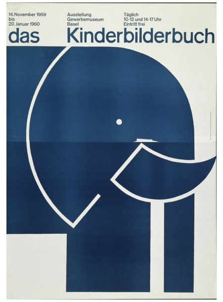
Emil taught that, above all, typography's purpose was to communicate ideas through
writing. He took the importance on sans-serif typefaces and placed them into his
work.

Hans Arp, Emil Ruder and Armin Hofmann at the Basel School
of Design in 1961
Like most designers he is associated as
part of the Swiss Design movement which he favored asymmetrical compositions, placing
a high importance on the counters of characters and the negative space of
compositions. A friend and associate of Hofmann, Frutiger and Müller Brockmann,
Ruder was the major key role in the development of graphic design in the 1940s
and 50s. His style has been adopted by many designers, and his use of grids in
design has influenced also the development of web design on different levels.
Hannah hoch

Hannah Hoch born in 1889 in Gotha, she was a dadaist artist. She started studying at the collage of art and craft in berlin, were she frequented the curriculum glass design and graphic arts. After she continued her studies studies on graphics sector at the National Institute of the Museum of Arts and Crafts. In 1915, Hoch worked with Raoul Hausmann who was a member of the Berlin Dadaist movement in 1919. When Hannah Hoch started working in the handicrafts department, the influence of her early work and training had reflected her later work (involving dress patterns and textiles).
Years later Hock had developed more friendship with other dadaists such as, Kurt Schwitters and Piet Mondrian many more. Also with Hausmann, they discovered the first art form technique that became known as photomontage. She is best know for her work of the Weimar period, when she was one of the contributor of the today's known photomontage. She died at the age of 88 in Berlin.
Noam Chomsky's bespectacled eyes and his arm and hands holding chalk along with actress Colleen Dewhurst's mouth and chin and a relic found in the Indus Valley pasted on a found sepia photograph - Homage to Hannah
Hoch.

Reference
Livingston, A. I., 2003. Graphic Design and Designers. London: The Thames & Hudson.
Saturday, January 25, 2014
Victor Moscoso
Mososo was a formally trained graphic designer who borrowed from comic books, Victorian images, Art Nouveau, and pop art. He used the techniques of vibrating colors to create the ‘psychedelic’ effect in many of his art work. The vibration is achieved by taking colors from the opposite end of the color wheel, each one having equal value (dark to light) and intensity (brightness).
He created evocative, vibrant, erotic, patterned posters designed for the newly emerged psychedelic culture of San Fransisco in the late 1960′s. He used hand made font, photo collage, and pop art to create a new aesthetic portraying psychedelic consciousness. He created “slow read” posters where the text was nearly unintelligible unless times was taken to stare into the image and sort out the dazzling effects of the contrasting colours and intense patterns.

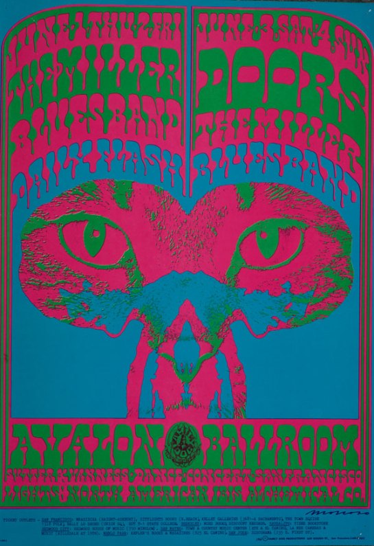
Victor Moscoso Avalon Ballroom 1967 The Doors, Steve Miller Blues Band

Victor Moscoso The Matrix 1967 Janis Joplin with Big Brother and the Holding Company
Art DECO(rative)
Art Deco was an art movement that
lived from the 1920s until around 1940. It stated in France with a group of
French decorators, designers, and artists at the Exposition Internationale
des Arts Décoratifs et Industriels Modernes, the name Art Deco was later
coined from that title which means decorative arts.
Art Deco was a very modern movement,
celebrating the beauty of technology in the early 1900’s. Art Deco contains
many references to trains, planes, cars, and skyscrapers, mixing art with
scientific improvement.
When human figures are seen in Art Deco, they’re often
very stylized, like in this painting by Tamara de Lempicka entitled Sleeping
Woman.
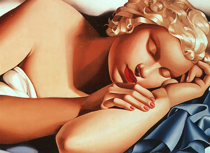
Every part of this painting is a
geometric solid—the figure’s head looks like it was carved out of a single
sphere, and her neck, arms, and fingers are all cylindrical.
Notice her metallic curls as well.
Metal looked figure prominently in Art Deco, and when actual metals couldn’t be
used (in paintings for instance) gradients were substituted to look like metal.
In that era where technology and
machines were being increasingly idolized, it was a revolutionary time where the artists began to perfected
humans, with matte skin and metal for hair.
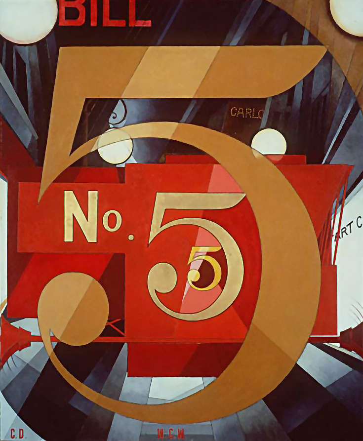
Bold colors, rays, and other strong geometric patterns
were a trademark of Art Deco too. Charles Delmuth’s I Saw the Figure Five in
Gold is a great example of Art Deco movement, geometry, and color.
Although the movement ended in the 40s, Art Deco is still
used today, often as a design element that references the optimism of the 1920s
and 30s when it seemed as though nothing could stand in the way of human
progress.
Reference
Elif Ayiter, N/A. The History of Visual Communication. [online] Available at: <http://www.citrinit as.com/history_of_viscom/index.html> [Accessed November 2013].
Livingston, A. I., 2003. Graphic Design and Designers. London: The Thames & Hudson.
DE STIJL
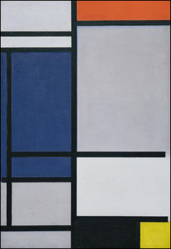
De Stijl movement originated
in Netherlands, and it embraces an abstract geometric forms, pared-down
aesthetic centered in basic visual elements such as geometric forms and primary
colors. The movement also rejected it predecessor movement decorative excesses
of the so-called Art Deco. Its creators envisioned the reduced quality of De
Stijl art as a universal visual language appropriate to the modern era.
Led by
the painters Theo van Doesburg and Piet Mondrian. It’s central and celebrated
figures De Stijl artists applied
their style to a host of media in the fine and applied arts and beyond.
Promoting their innovative ideas in their journal of the same name, the members
envisioned nothing less than the ideal fusion of form and function, thereby
making De Stijl in effect the innovative
style.
To this end, De Stijl artists turned their attention to virtually
all other art forms as well, including industrial design, typography, even
literature and music and not only
to fine art media such as painting and sculpture, but virtually all other art
forms as well, including industrial design, typography, even literature and
music.
De Stijl's influence was perhaps felt most noticeably in the realm of
architecture, helping give rise to the International Style of the 1920s - 30s.
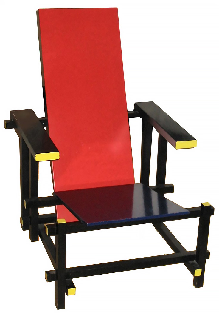
Now, here’s one of the more unique creations from this era: a chair by Gerrit Rietvel, fashioned in the same Neo-Plastic or De Stijl style.

Cover for De Stijl done in 1922 by Theo van Doesburg. Such typography shown in this cover in particular is asymmetrically well balanced in each four corners of an implied rectangle involving vertical and horizontal words.
.jpg)


Beazley, M., Aynsley, J., eds., 2004. Pioneers of Modern Graphic Design: A Complete History. London: Octopus Publishing Group Ltd.
Livingston, A. I., 2003. Graphic Design and Designers. London: The Thames & Hudson.

Cover for De Stijl done in 1922 by Theo van Doesburg. Such typography shown in this cover in particular is asymmetrically well balanced in each four corners of an implied rectangle involving vertical and horizontal words.
.jpg)


Reference
Beazley, M., Aynsley, J., eds., 2004. Pioneers of Modern Graphic Design: A Complete History. London: Octopus Publishing Group Ltd.
Joost Scmidt 1893 - 1948
Joost Scmidt 1893 - 1948


He studied in 1910 -1914 in Weimar and after military service and a period as a prisoner of war, he returned to
Germany in 1918.
From 1919 to 1924/25, he trained in the workshop for stone and wood
sculpture under Johannes Itten and Oskar Schlemmer.
The design of a poster for the Bauhaus exhibition of 1923 in Weimar
while he was student
In 1925 he accepted an offer from Walter Gropius to become a junior master at the Bauhaus Dessau
His students were
required to attend two semesters of lettering design.
Here Schmidt
explored the structure of letters – circle, square and rectangle – and then
their flexibility in terms of shape and size as well as the treatment of colour
and surface.
Through his
teachings he strove to reform letters, which then became validated and
standardized internationally.

This was probably
Schmidt’s best known piece.
It was inspired
heavily by constructivism and de stijl
which was designed for a competition,
In the form of a cross made up of circles and squares.
The diagonally placed cross incorporates the (Bauhaus logo)
Logo designed by Oskar Schlemmer,
The original version of the poster, which was used for advertising
purposes in 120 German railway stations,
Specifies the months of July to September for exhibition dates.
Bauhaus
Bauhaus was one of the most definitive design movements of
the modern age, reaching its peak between the 2 world wars. The word Bauhaus
name, mostly translated from German, means house of construction or school of
building, even though there was no architecture as such within the first years
of its existence. Bauhaus was a new type of art school, historically European
art academies thought each design subject separately, the Bauhaus offered
foundation training in many design disciplines, they believed in verity.
Understanding mass production was part of the curriculum and the school sought
to develop students with art and craft whilst embracing new technologies. It
was also the beginning of the art school as an alternative way of life. Germany
at that time was a rather conservative place though.
Bauhaus initial idea was to reject the idea of decorative
art and replace it with minimalism in mass production. Its main inspiration
came from the De Stijl movement which was a modernist movement founded by Theo
Van Doesbeurg, its characteristics were the use of primary colours and
horizontal and vertical lines and rectangular forms. The Bauhaus focused on
intense form, absolute clarity, and distinctive visual identity.
Some Important Highlights in the Bouhaus history
•1919 – Bauhaus founded in Weinmar, Gremany. By Walter Gropius
•1921 – Theo Van Doesburg (de Stijl)
visited the school and thought them ideas from futurism, constructivism, surrealism and dada. Bauhaus also starts
to offer more varied courses. Women also are now allowed to enroll.
•1923- Johannes itten Leaves, being replaced by Moholy-Nagy
who introduced now typography.
•1924- Bauhaus moved to Dessau because
of funding problems.
•1926- Dessau Bauhaus finished being
built.
•1928- Gropius resigned along with
Moholy-Nagy and Bayer. Hannes Meyer became director.
•1930- Hannes Meyer dismissed as
director. Ludwig Meis Becomes director
of the school.
•1931-1933 Van Der Rohe cut out things from the curriculum.
Due to lack of funds the Dessau Bauhaus was closed. Van Der Rohe moved the bauhaus to berlin (only lasted for a short
time)
•1933 Nazis closed the school
•1933 onwards – Moholy-Nagy established
the Bauhaus in Chicago which is now called the The Institute of Design

Characteristics of Bauhaus
•Geometric, functional and modern
•Order, asymmetry
•Rectangular grid structure
•Horizontals and verticals were dominant
•Circles, squares,
rectangles, triangles, bars, and
rules to unify or separate elements versus
being used
for decoration
•Extreme contrast in type size and
weight to achieve
various degrees of emphasis
•Typography without capitals -
San Serif
•Introduction of flush
left - rag right typography
•Copy rotated 90
degrees
•Only structurally
essential components used.
•Elementary forms and
the use of black plus one
bright hue
New York School Era

Paul rand's poster no way out made in 1950
Another paul rand's design for the IBM Company, that for me it was one of the biggest

Bass Poster for Exodus 1960's
Reference
Livingston, A. I., 2003. Graphic Design and Designers. London: The Thames & Hudson.
Subscribe to:
Posts (Atom)


